Four Seasons Shenzhen
深圳四季酒店
In-room collateral
For in-room collateral, we took our cues from China’s modern “city of design”. We took a contemporary approach, incorporating design elements from the city such as the Four Seasons architecture, high-design chairs and birds.
The desig ...
更 多
Four Seasons Shenzhen
深圳四季酒店
In-room collateral
For in-room collateral, we took our cues from China’s modern “city of design”. We took a contemporary approach, incorporating design elements from the city such as the Four Seasons architecture, high-design chairs and birds.
The desig ...
Four Seasons Shenzhen
深圳四季酒店
In-room collateral
For in-room collateral, we took our cues from China’s modern “city of design”. We took a contemporary approach, incorporating design elements from the city such as the Four Seasons architecture, high-design chairs and birds.
The design included individual
colors on squares, representing individual personalities, and the color theme is carried throughout the room in an abstract way, with in-room items classified according to three different colors.
The key card holder is designed to be at an angle, inspired by the Four Seasons Shenzhen building.
“Foo”, All-Day Dining Restaurant
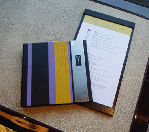
We took the artwork on the ceiling as our inspiration for the menu design, incorporating metal die overlaid on book cloth.
“Yue”, Chinese Restaurant For the Chinese restaurant menu
we also used book cloth and a central metal square, with the design featuring part of the Chinese character “Yue” for Canton, for this Cantonese restaurant. Drink and food menus are distinguished by color (green for drink, yellow/orange for food).
“Yi”, Bar Menu
For the bar menu, we used a combination of different leathers, seamlessly joined with metal. For the menu cover, we took the “Y” in Y to create a cocktail glass.
客房内宣传品设计
深圳是国内公认的“设计之都”,因此我们选择以现代化的设计风格,配以带有城市特色的元素,如充满设计感的酒店建筑外型、椅子及鸟等形象来诠释品牌。
视觉形象
主要由3色的几何形状组成,代表着3种不同的个性。而客房内部的宣传品设计延续了3色主题,用不同的颜色代表不同的服务和物品。房卡套的设计借鉴了深圳四季酒店大楼的独特几何外型。
“馥”全日餐厅菜单
我们就地取材,用餐厅天顶悬挂的艺术品外型为灵感设计了餐厅的菜单封面,结合了装帧布和金属质感的菜单和艺术品遥相呼应,为住客的用餐体验增添一份艺术气息。
“粤”中餐厅
餐厅标识的设计灵感取自“粤”字里的“米”字型,我们同样用了装帧布和金属感的标识。菜单内页则继续运用色彩设计,绿色和橙黄色分别代表饮品和食物。
“逸”酒吧菜单
酒吧菜单的材质我们选择了不同质感的皮质,同样配以金属。酒吧的标识设计看上去是一只鸡尾酒杯,而形状恰恰来自酒吧名字拼音的首字母“Y”。


